Designing the First Version of a
Smart Event Networking Tool
Despite attending events with strong networking potential, attendees lack a smart, personalized, and structured way to connect, recall, and follow up, leading to missed opportunities, low engagement, and poor lead conversion.
TIMELINE
Jan 25 - March 25
SCOPE
End-to-end: problem framing, user research, information architecture, wireframes, high-fidelity UI, and prototype testing.
TEAM
3 people — a product manager, me as the sole designer handling research, UX, and UI, and one developer building the app.
500+
Users acquired
₹2.5L
Revenue generated

Background
We were three college students who kept attending events and losing track of people we met. After trying and giving up on paper cards, LinkedIn, and WhatsApp,
we just decided to build something ourselves.
The Problem
Event networking is broken by design
"At a packed tech conference, I had great conversations and exchanged a bunch of business cards. By the next day, most of those names were just a blur."
Professionals attending conferences, trade shows, and meet-ups had no smart, structured way to share their details, remember who they met, or follow up. Networking felt random — more luck than intent.
WHO
Founders, sales reps, marketers, students at in-person events
WHERE
Exhibitions, conferences, trade shows, campus fests
CORE PAIN
Paper cards are forgettable, untrackable, and impossible to update
Research
To validate assumptions, I ran primary interviews with the target audience and reviewed existing digital card and networking apps from both design and business lenses.
Key findings from interviews:
Juggling LinkedIn, WhatsApp, and email during quick conversations felt clumsy
Users mostly represented a brand, they wanted customization to match company identity, not just personal style
No way to measure ROI on business card exchanges
"I correct my old phone number by hand while exchanging printed cards"
"I keep hot and cold leads in separate pockets to sort them later"
Design gaps in competitors
Founders, sales reps, marketers, students at in-person events
Business gaps in competitors
Founders, sales reps, marketers, students at in-person events
User Personas
Business Owner / Founder
Runs out of printed cards mid-event; types out contacts awkwardly; needs a live, always-updated profile.
Sales / Marketing Rep
Collects stacks of cards, forgets context; wants to track card views and log notes on leads.
Solution
#1 How might we simplify and modernize how people share contact information at events?

Live digital card shared via NFC or QR
A profile that updates in real time — no reprinting, no crossed-out numbers. Tap or scan to share in under 3 seconds. Onboarding kept to 2 steps so users are ready before the first conversation ends.
#2 How might we enable personalized, brand-relevant networking experiences at events?
3 profile layouts + brand color theming
Three layout variants to suit different use cases. A color theme system lets users match their brand.
Layout 1
Layout 2
Layout 3

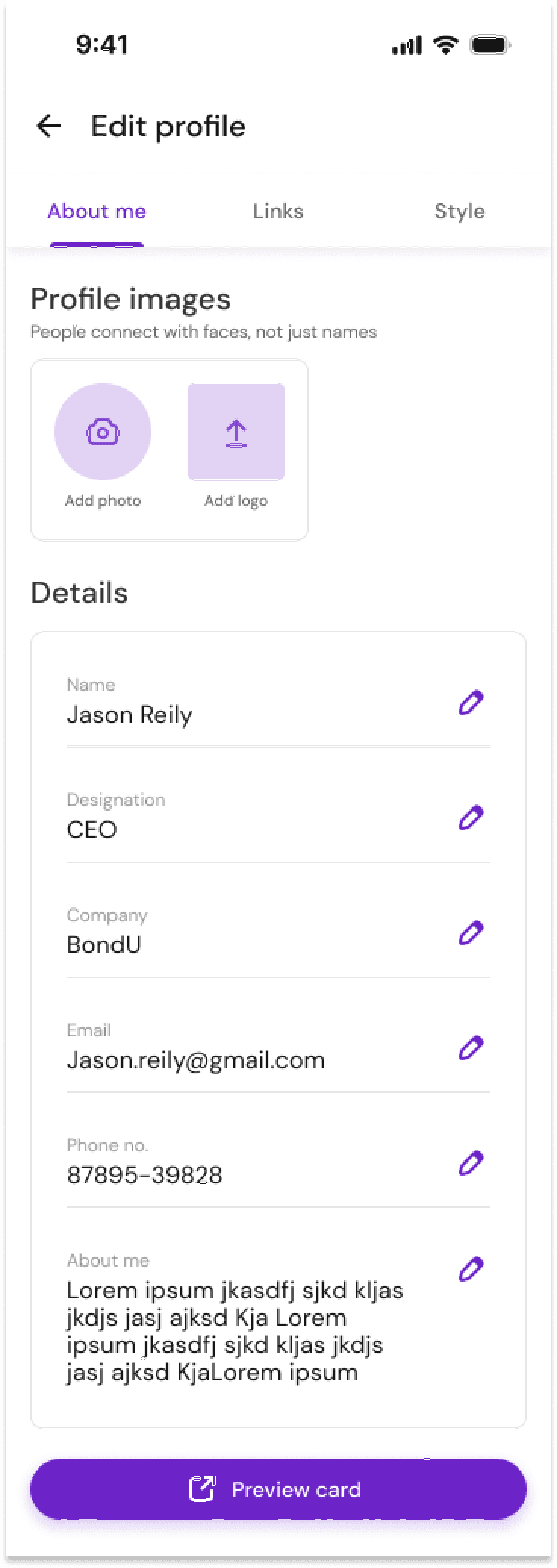
Edit profile divided into About, Links, and Style — with a pinned live preview so changes are always visible.


#3 How might we help attendees recall who they met and manage follow-ups post-event?
Network screen with role filters + date search
All connections in one place, filterable by role (founder, investor, etc.) and searchable by name or date met. Replaces the "separate pockets" workaround with a structured digital equivalent that's fast to use.

Testing
Maze prototype → beta at a business expo
Tested a high-fidelity prototype via Maze with early users, then beta-launched at a live business expo using NFC smart cards where 150+ professionals created real profiles.
What worked
Navigation rated intuitive; strong interest in NFC sharing; overall flow easy to follow
What we fixed
Unclear icons in some actions; preview section had glitches — refined before full launch
Outcome
Launched at 2 trade shows. Acquired 500+ users.
The MVP launched successfully at two trade shows, generating ₹2.5L in revenue and receiving appreciation from the UP Government. Built by a 3-person student team with no outside resources.
Learnings
↗ Research drives real decisions. Interview insights directly shaped design choices — the brand theming came from users representing companies, not themselves. The filters came from the "separate pockets" workaround.
↗ MVP constraints sharpen focus. A 4-week timeline forced ruthless prioritization — separating must-have for launch from nice-to-have for V2.
↗ Real-world testing beats assumptions. Maze results and the expo beta surfaced icon clarity issues invisible in internal reviews — shipping early and iterating was the right call.
↗ Design is a business function. Connecting design choices to north star metrics and revenue shaped how I think about every feature decision.
Simple ideas,
Thoughtful execution.
DS

© 2026
All Rights Reserved.